Colour Combination for Living Room: 20+ Curated Styles for 2026
When refreshing a home, selecting the perfect colour combination for living room spaces acts as the structural anchor of the entire house. It defines the room’s character, commands attention, and sets the tone for your furniture, cabinetry, and decor. In 2026, the approach to home aesthetics has shifted fundamentally. Indian homeowners are moving away from loud, high-contrast accent walls and embracing "quiet luxury", spaces that prioritize emotional comfort, rich textures, and sophisticated harmony.
If you are planning to give your home a fresh look, picking the ideal colour combination for living room layouts is key to navigating the intersection of global design shifts and Indian architectural requirements. Below is an expert guide to the absolute best feature wall combinations dominating contemporary Indian homes this year.
Which wall should be the feature wall in an Indian living room?
The most frequently asked question by homeowners is always about placement: “How do I choose which wall gets the accent colour?”
As a rule of thumb, the feature wall should be the natural focal point of the room the moment you walk in. In most Indian layouts, this is either the wall behind the main sofa arrangement or the primary television/entertainment unit wall.
However, you must also consider architectural elements and light. If your room has a large French window or a balcony door, choose the solid wall adjacent to it. This allows natural daylight to hit the surface at an angle, beautifully bringing out the true undertones and subtle textures of your selected paint. Avoid choosing a wall with multiple doors, cutouts, or heavy switchboards, as these interruptions break the visual continuity.
Top 4 Trending Accent Colours for Indian Homes in 2026
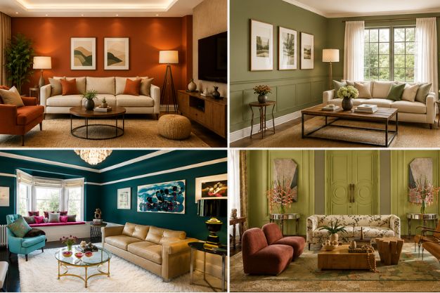
The 2026 palette is deeply rooted in nature, slowness, and tactile warmth. Moving away from stark, sterile greys, the trendiest spaces are adopting tones that evoke calm intimacy and understated optimism.
1. Moonlit Silk (The 2026 Anchor Neutral)
Emerging as a massive cultural favorite across the Indian design landscape, this shade is a warm, luminous, and slightly memory-washed neutral green-beige. It mimics the soft, comforting light of home at dusk. It is elegant without being loud, offering an incredible canvas for Indian architecture.
2. Terracotta Rust
A sophisticated, mineral-inspired evolution of traditional clay. Terracotta Rust brings the warmth of earthen pottery and organic energy into modern living apartments, offering an instant grounded feel.
3. Muted Sage Green
Nature-inspired greens remain central to well-being-focused interiors. Moss and sage tones act as soft, understated, and mindful backdrops that blur the boundary between indoor living and outdoor greenery.
4. Deep Teal & Emerald
For those who desire depth, drama, and a touch of regal sophistication, deep jewelled shades like teal and emerald are the premium choice. Used intentionally, these complex hues add incredible contrast without overwhelming the living area.
The Best Feature Wall Colour Combination for Living Room Spaces
To make these trending shades work flawlessly, they must be paired with the right complementary tones. Here are the top designer-approved combinations for each key colour to help you settle on the perfect colour combination for living room projects:
Moonlit Silk Combinations
- Moonlit Silk + Warm Cream: A soft, serene, and monochromatic look that expands smaller spaces visually.
- Moonlit Silk + Deep Charcoal: A balanced, contemporary contrast where the dark elements accentuate the luminous quality of the feature wall.
- Moonlit Silk + Soft Butterscotch: A nostalgic, warm combination that beautifully complements heritage wooden furniture.
Terracotta Rust Combinations
- Terracotta Rust + Muted Apricot: A warm, tonal layered look that feels incredibly inviting under warm ambient lighting.
- Terracotta Rust + Olive-Grey: An organic, grounded pairing where the coolness of the grey tames the fiery nature of the rust.
- Terracotta Rust + Soft Ivory: A crisp, modern interpretation that keeps the traditional warmth of terracotta looking clean and airy.
Muted Sage Green Combinations
- Muted Sage Green + Warm Beige: A classic, nature-inspired palette that brings a relaxing, biophilic spa-like vibe to urban homes.
- Muted Sage Green + Dusty Rose: A subtle, sophisticated play on complementary opposites that adds a gentle, poetic touch to the room.
- Muted Sage Green + Soft Ochre: A cheerful yet grounded mix that reflects natural sunlight beautifully during daytime hours.
Deep Teal & Emerald Combinations
- Deep Teal + Smoked Oak: A rich, executive luxury pairing where the dark wood grain enhances the depth of the teal paint.
- Deep Emerald + Butter Yellow: An uplifting, artistic contrast where the soft yellow acts as a gentle, creamy counterweight to the intense green.
- Deep Teal + Metallic Gilver (Silver-Gold): A premium option featuring metallic accents on the trims or moldings for a touch of festive Indian glamor.
Can the 2026 Trending Colours Be Combined Together?
Absolutely. Because the 2026 palette is unified by soft, earth-derived undertones, these four trending colours can coexist harmoniously within an open-concept Indian layout.
For instance, you can use Moonlit Silk as the master canvas across three walls to maintain fluidity and brightness. Design your primary feature wall in Deep Teal for structural drama, and carry subtle accents of Terracotta Rust or Muted Sage Green into adjacent spaces—such as an open dining area wall or a semi-partitioned home office nook. This creates a cohesive, multi-layered visual narrative rather than disconnected blocks of colour.
Interior Expert Styling Tips: Crafting Artisanal Surfaces
Choosing the paint colour is only half the battle; the material, finish, and integration with architectural elements dictate the final premium feel of the room. Here are three expert tips to design your feature wall:
- Embrace Tactile Finishes Over Flat Paint: Move away from basic mattes or high-gloss walls. Incorporate microcement finishes, subtle lime-wash textures, or high-end wallpapers featuring traditional motifs like delicate Himalayan rose trellises. These artisanal surfaces catch light dynamically, giving your feature wall an evolving character from day to night.
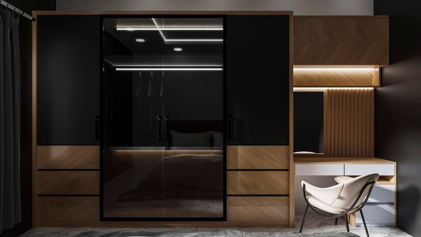
- Incorporate Architectural Molding and Fluted Paneling: Instead of painting a flat surface, apply clean geometric wall trims or slim, vertical fluted wooden louvers before painting. Applying a deep tone like Emerald or Teal across a textured, paneled surface creates deep shadows and structural purity that feels structural and bespoke.
- Layer the Lighting Intentionally: Never let a feature wall sit under flat, harsh white ceiling downlights. Use warm LED hidden profile lighting inside false ceilings to wash the wall with a gentle glow. Pair this with a low architectural accent chair and a minimalist floor lamp to turn your feature wall into a cozy visual sanctuary.
Some Bonus Wall Colour Combination Ideas by Novella Kitchens
To give your home a comprehensive, designer-approved upgrade, our spatial experts have analyzed the most sought-after Indian layouts. Below is a detailed breakdown of how to execute these combinations beautifully, using the right room wall colour combination and strategic furniture textures to elevate the overall look.
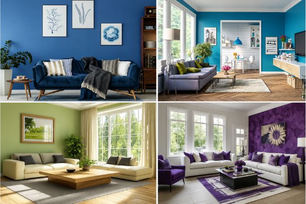
#1: How to use purple and neutrals for a royal feature wall?
Pair a deep regal purple or plum feature wall with soft beige or muted ivory neutrals on the surrounding surfaces. To balance this intense room wall colour combination, integrate low-slung entertainment units in an ultra-matte cream laminate finish. This prevents the space from feeling dark while maintaining an opulent, majestic aesthetic.
#2: What to do with green and cream for a welcoming feature wall?
An olive or forest green accent wall paired with warm cream creates a naturally inviting, biophilic atmosphere. Enhance this welcoming room wall colour combination by choosing floating TV ledges or open display shelving from Novella in light oak or ash-wood textures, allowing the organic green backdrop to truly pop.
#3: Are aqua and white a good two-colour combination for living room walls?
Yes, this pairing is exceptionally refreshing for sunlit spaces. To execute this room wall colour combination successfully, skip high-gloss finishes. Use a smooth matte aqua on your main wall, crisp white on the others, and add structure with custom matte grey or white handleless storage consoles to give it a sharp, contemporary edge.
#4: How to achieve a sophisticated look with shades of grey?
The secret to a monochromatic grey space is texture and tonal variation. Paint your feature wall in a dark charcoal or light concrete-wash finish, and use a soft, misty grey on the remaining walls. Complement this modern room wall colour combination with high-end acrylic glass cabinetry in dark graphite tones to anchor the room's premium feel.
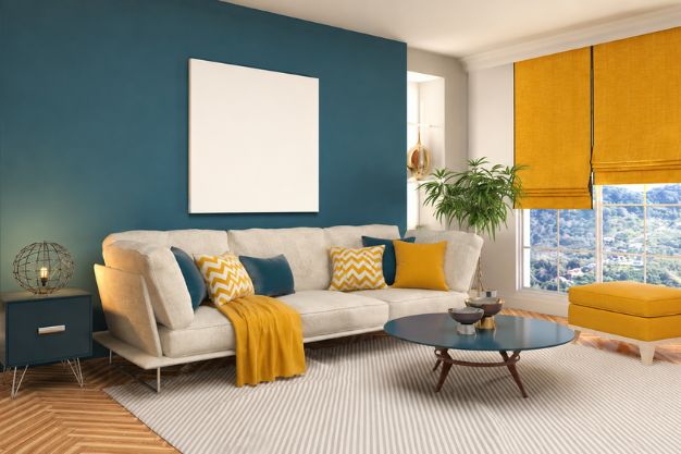
#5: Can we use navy blue with light colours for a colour combination for hall spaces?
Absolutely. Navy blue is a timeless choice for a formal lounge or reception space. When finalizing a colour combination for hall layouts, pair navy with crisp off-white or pale greige. Our design experts suggest balancing this bold contrast by framing the navy feature wall with slim, floating storage units in warm walnut veneers to introduce an element of cozy sophistication.
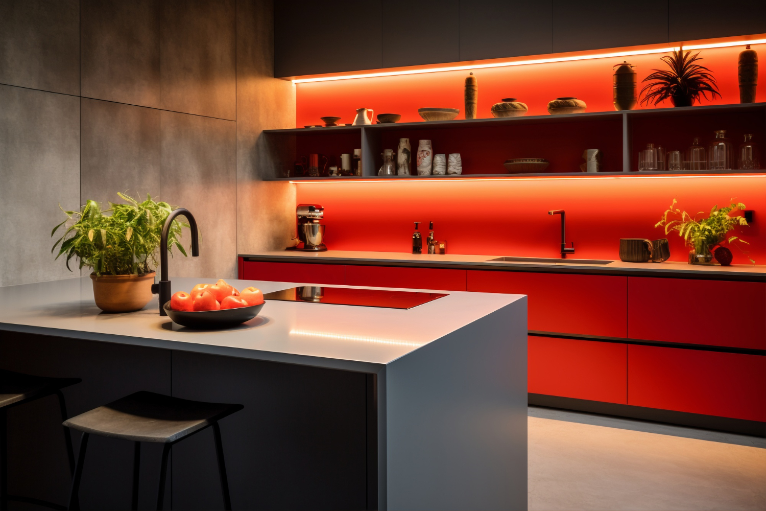
#6: How can brick red and muted colours create a rustic feature wall?
A terracotta or brick red feature wall introduces instant warmth. Keep the surrounding surfaces muted with soft sand or canvas shades. To ensure this colour combination for hall or common areas looks rustic-chic, complement the wall with open-shelf bars or custom sideboards featuring matte black metal profiles and rich wooden grain tops.
#7: Are turquoise and grey a good match for a two-colour combination for walls?
They are an excellent match for a balanced, modern layout. The coolness of a stone-grey wall grounds the vibrant, energetic nature of a turquoise feature wall. This unique colour combination for hall spaces can be seamlessly integrated with bespoke modular storage solutions in a satin-grey finish to bridge the gap between the two distinct tones.
#8: How to mix white, blue, and brick orange for a striking feature wall?
Use a deep cobalt or royal blue on your primary wall, crisp white on adjacent walls, and introduce brick orange through built-in accents. For instance, a custom Novella media unit featuring a mix of sleek white cabinetry and open brick-orange display niches creates a striking, artistic focal point.
#9: What makes vivid purple, cream, and white ideal for a desi feature wall?
This palette perfectly balances traditional Indian festive joy with modern restraint. Use vivid purple on your main accent wall, cream on the rest of the room, and use white on architectural elements like crown moldings or fluted wall panels. Pair this with rich gold-accented decor for a beautiful heritage-modern aesthetic.
#10: How can sea green and white refresh your living room wall?
Sea green brings an airy, tranquil energy to high-traffic zones. Pair it with pure white to maximize natural light reflection. To keep the design sharp and functional, style this setup with sleek, handleless floating cabinets in a crisp white lacquer finish.
#11: What to do with grey and white for a cool neutral wall?
For an ultra-minimalist, sophisticated aesthetic, paint your feature wall a cool slate grey and keep the surrounding walls stark white. Keep the lines clean by integrating integrated media storage systems in matching matte greys to achieve a streamlined, clutter-free architecture.
#12: Do yellow and white work well for a colour combination for hall areas?
Yes, a cheerful mustard or saffron yellow feature wall instantly brightens dark hallways and low-light formal spaces. Balance the high energy of yellow by using it as a deliberate colour combination for hall entries, paired with crisp white walls and custom storage furniture in soft, neutral wood tones like birch or maple.
#13: What makes light slate grey and white a dreamy feature wall choice?
This combination offers a serene, cloud-like atmosphere. The subtle, blue-toned undertones of light slate grey contrast gently against pure white. Elevate this dreamy setting with floating, wall-mounted consoles featuring glass fronts and integrated warm LED profile lighting.
#14: How can saturated blue and white cool down your living room wall?
In regions facing intense Indian summers, a deep, saturated blue accent wall acts as a visual cooling agent. Pair it with pure white to keep things crisp. Complete the look with sleek modular furniture in cool-toned light ash wood to maintain a fresh, breezy atmosphere.
#15: What to do with stripes of Crayola blue bell and cream shades?
Vertical or horizontal stripes in soft periwinkle (Crayola blue bell) and cream create a playful, classic look. Keep the rest of the room grounded by using solid, un-patterned furniture layouts—such as a custom cream multi-media console—to keep the room looking refined rather than cluttered.
#16: Are pastel pink and cream a good wall colour combination?
Yes, this pairing embodies the highly popular "soft luxury" aesthetic. It creates a calming, warm, and romantic environment. Style this beautiful backdrop with sleek white storage solutions or soft grey matte cabinetry to prevent it from looking overly sugary.
#17: What makes magenta and white an energetic feature wall option?
Magenta is a bold, festive, and high-energy jewel tone. When paired with stark white walls, it creates a striking contemporary statement. To manage this intense energy beautifully, balance the wall with minimal, ultra-sleek handleless media consoles in matching pure white acrylics.
#18: Is pink and white a good idea for living room walls?
Yes, provided you choose the right hue. Move away from bright pinks and embrace dusty rose or blush pink on your feature wall, paired with soft ivory white. Complement this gentle palette with custom living room storage featuring premium metallic trims or warm wood highlights.
#19: How does light cerulean and off-white work for a home paint colour combination?
This sky-inspired combination feels exceptionally open and breezy. Use light cerulean blue on the feature wall to bring the outdoors in, and use off-white on the surrounding surfaces. Style this with minimalist, Scandinavian-style floating cabinetry from Novella to enhance the airy feel.
#20: How to incorporate tuft bush and cream in the living room walls?
Tuft bush—a muted, sophisticated dusty pink-beige hybrid, pairs beautifully with rich cream. It creates a warm, understated luxury canvas. Enhance this cozy look with built-in custom wall units featuring light oak finishes and soft, integrated ambient lighting.
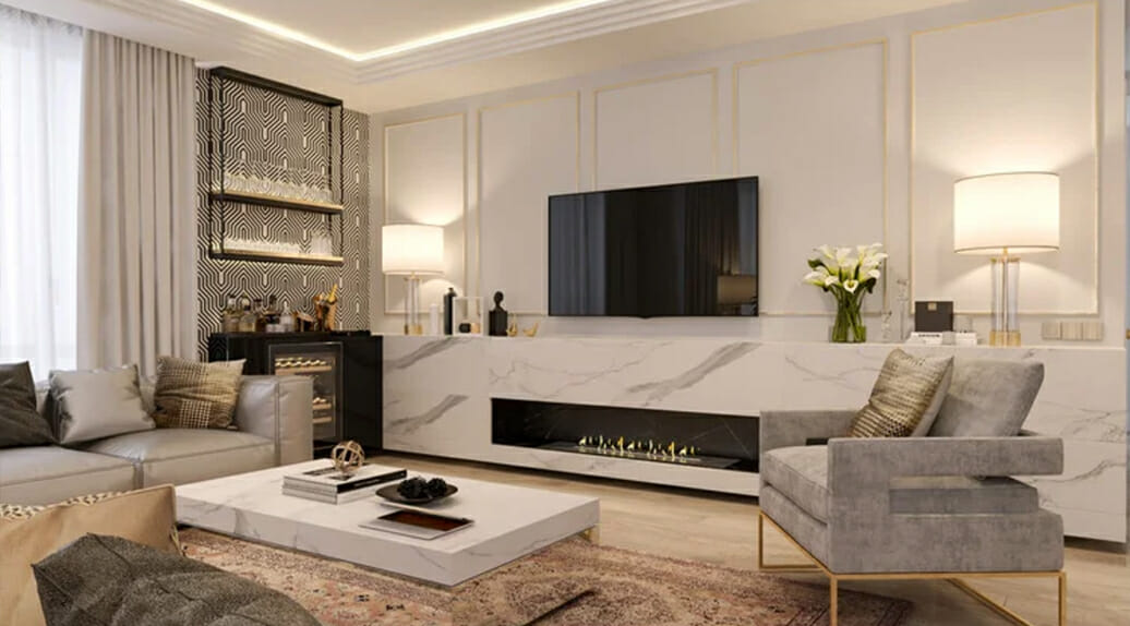
Bringing it All Together with Novella Kitchens
Achieving a perfectly balanced living space requires looking beyond the walls to ensure your fixed cabinetry and spatial layout match your chosen palette. This is where Novella Kitchens transforms your vision into reality.
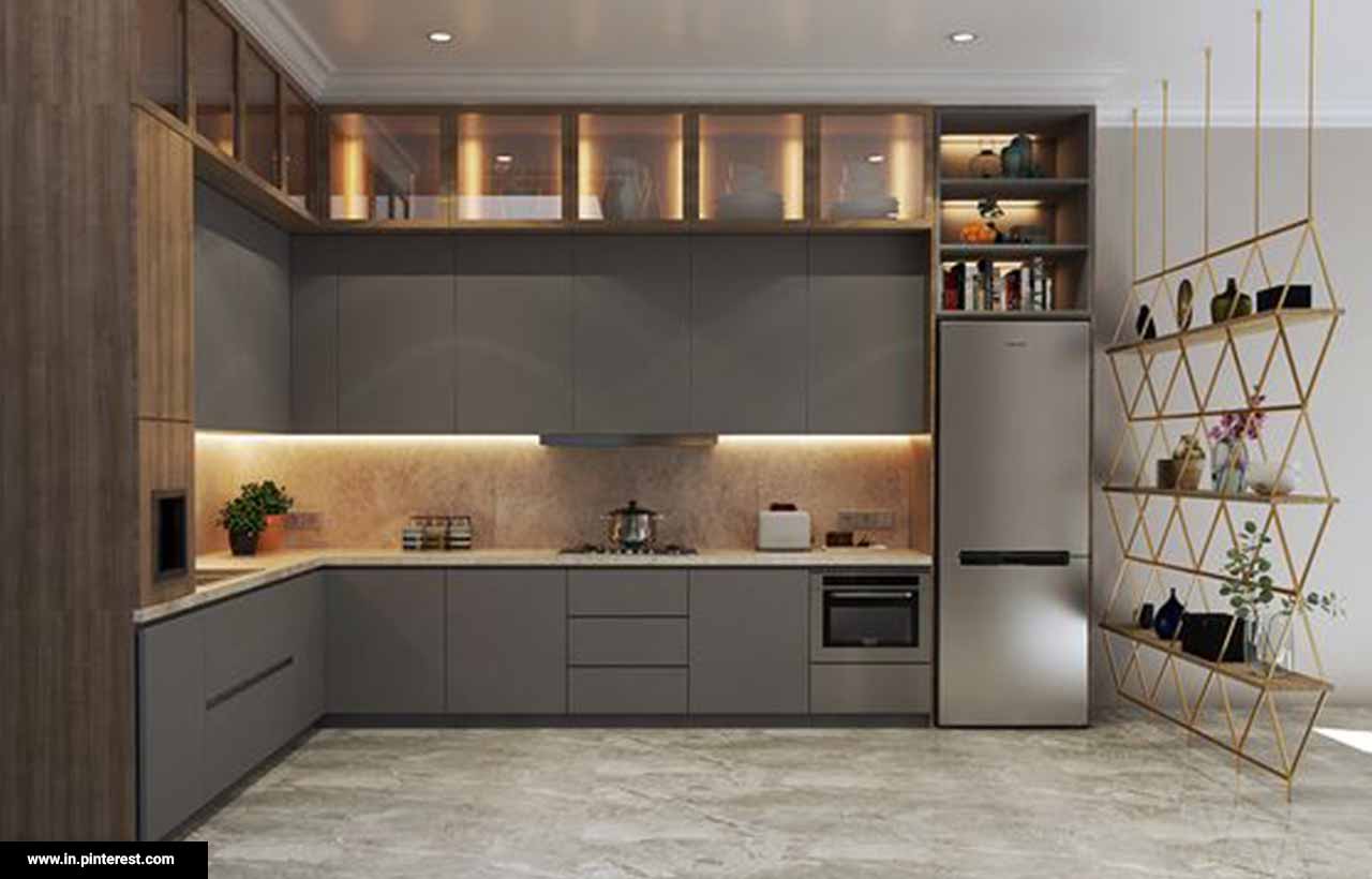
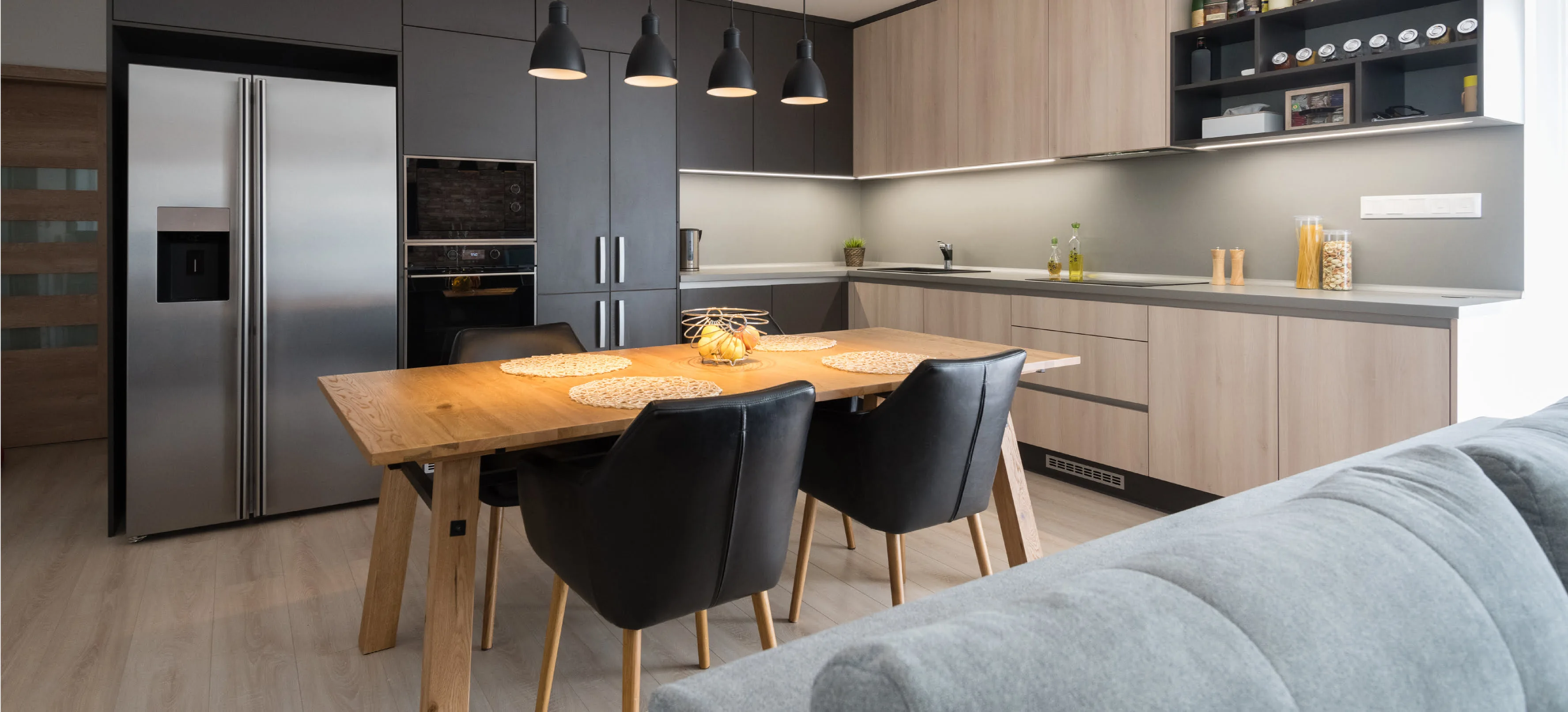
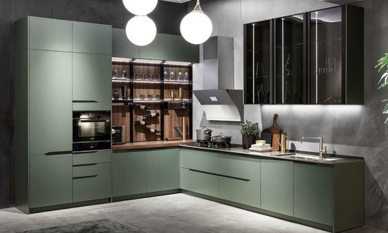
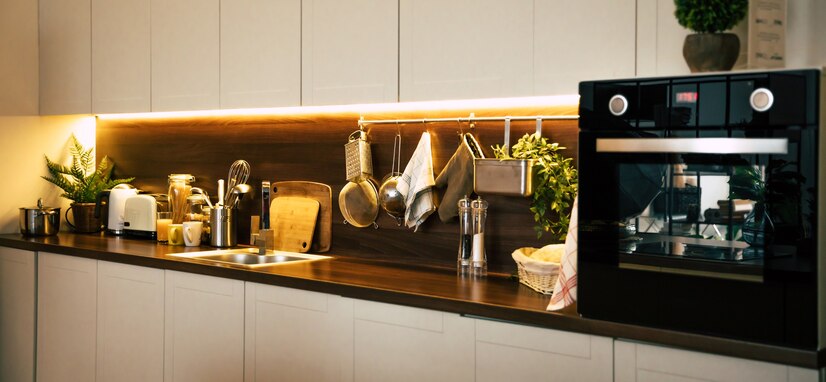
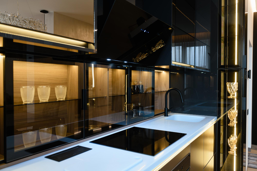
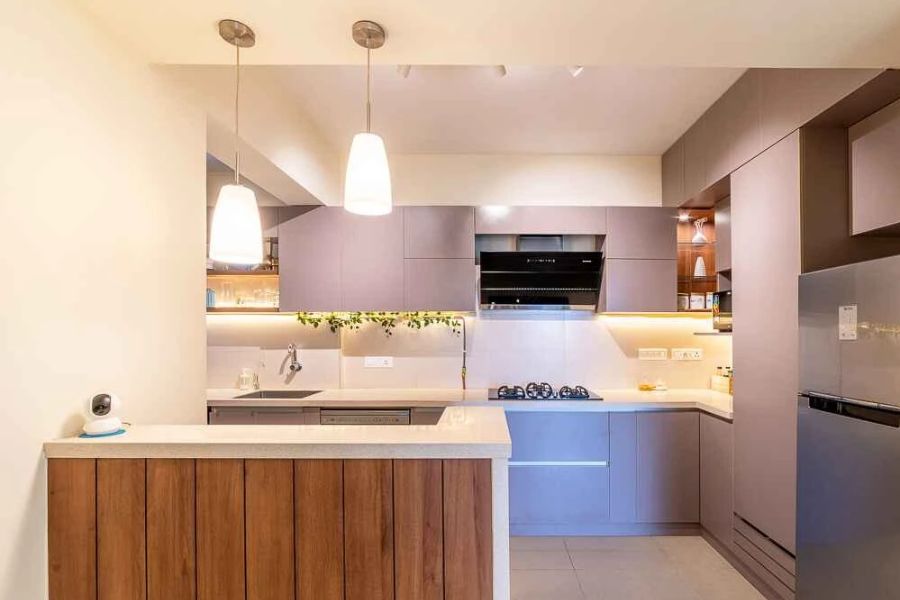
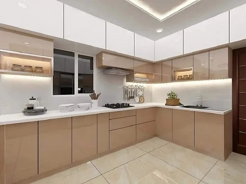
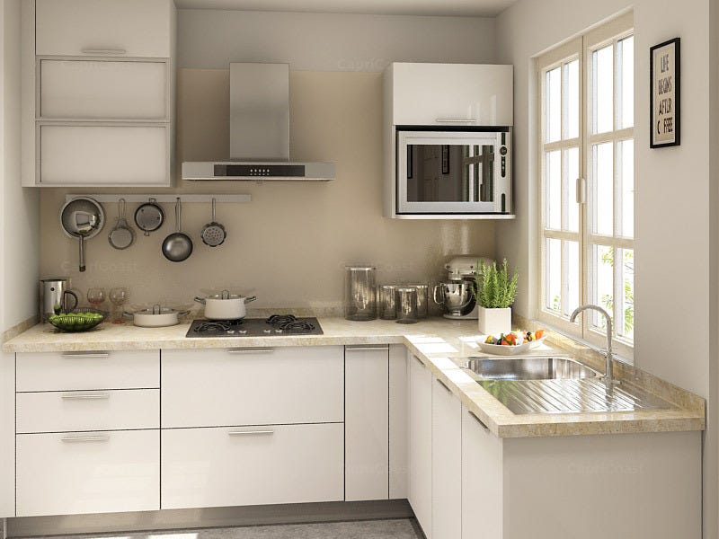
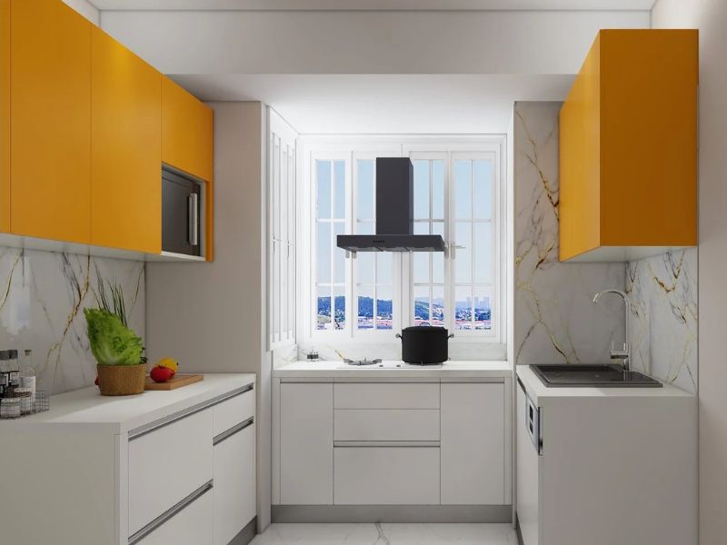
While widely recognised as premium modular kitchen manufacturers in gurugram, our design expertise extends seamlessly into comprehensive, open-plan home integration. Our team understands how custom furniture finishes, material durability, and smart storage interact with the latest interior layout trends.
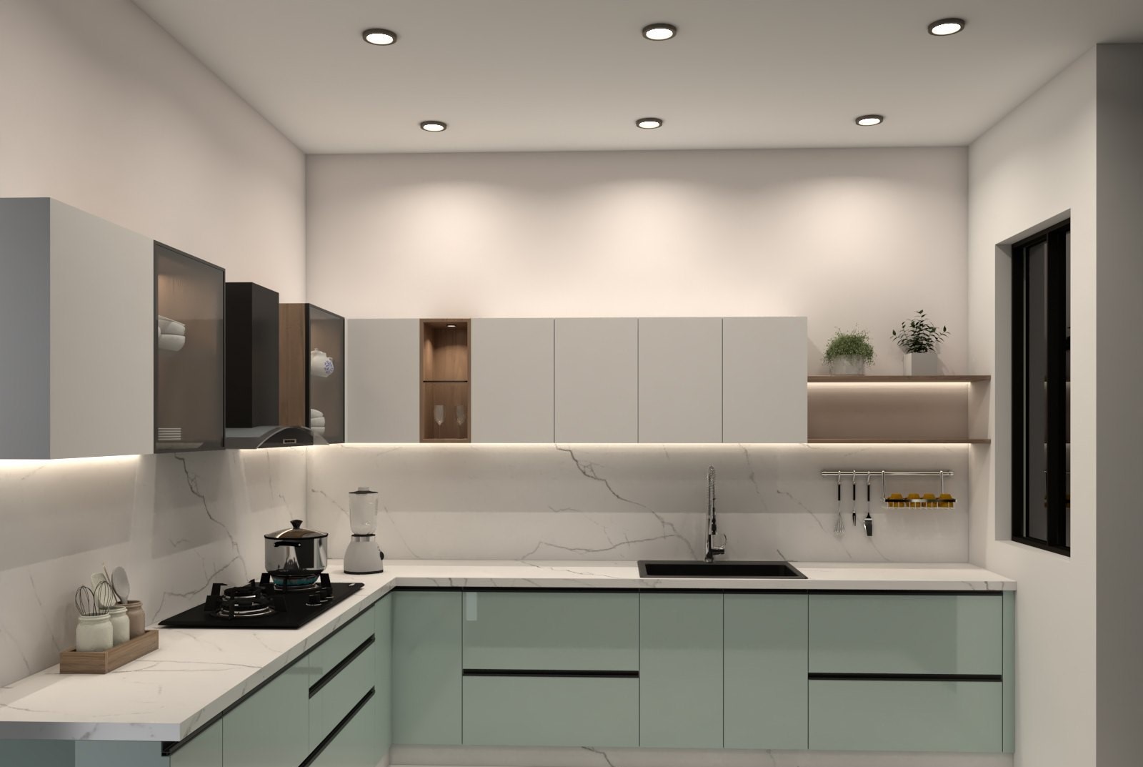
Whether you need an exquisitely executed Luxury Modular Kitchen Gurgaon setup that flows into your dining area, or a bespoke floating TV console finished in rich smoked oak to contrast against your living room accent wall, we deliver German-engineered solutions tailored to modern properties. As established modular kitchen manufacturers in gurugram, our design studio on Golf Course Road collaborates with you to choose the exact textures, laminates, and spatial planning strategies needed to craft an authentic, clutter-free environment.
Conclusion: Designing Your Dream Space
Choosing the right colour combination for living room surfaces is ultimately about creating a sanctuary that mirrors your personal journey. In 2026, the shift toward sophisticated, earth-derived tones and rich, tactile textures provides a needed retreat from the fast-paced world outside.
True residential luxury is achieved when your walls, architectural layouts, and adjacent spaces speak the same design language. From designing a breathtaking Luxury Modular Kitchen Gurgaon showstopper to anchoring your main lounge wall, Novella Kitchens bridges the gap between vision and execution. As trusted modular kitchen manufacturers in gurugram, we combine these 2026 paint trends with beautifully tailored, German-engineered cabinetry to transform your home into a cohesive, structurally balanced, and clutter-free masterpiece.
Frequently Asked Questions (FAQs)
Q1. What are the main living room colour trends for 2026?
The core trends centre on mindful living, earthy tones, and sensory comfort. Deep jewel accent shades like teal and emerald are paired with soft, grounding neutrals like Moonlit Silk and warm terracotta-rose hybrids to create balanced, intentional spaces.
Q2. How do I make a small Indian living room look bigger with a feature wall?
Avoid high-contrast or extremely dark accent walls on low-light surfaces. Instead, pick an elegant tone-on-tone palette, such as Moonlit Silk paired with warm cream, and choose low-profile, modular furniture silhouettes that elongate the room visually.
Q3. Can I use wallpaper instead of paint for a feature wall?
Yes. Wallpaper is a major trend for 2026, provided it emphasises craftsmanship and provenance. Look for textured papers, hand-block print effects, or designs with subtle metallic gilver details that celebrate regional artistry without introducing chaotic patterns.
Q4. How does lighting affect the feature wall colour?
Indian homes often use a mix of cool daylight and warm evening lighting. Cool light can make greens and blues look crisp, but might turn warm neutrals slightly flat. Warm lighting elevates terracotta, golds, and earthy neutrals, transforming the feature wall into a warm, comforting cocoon at night.